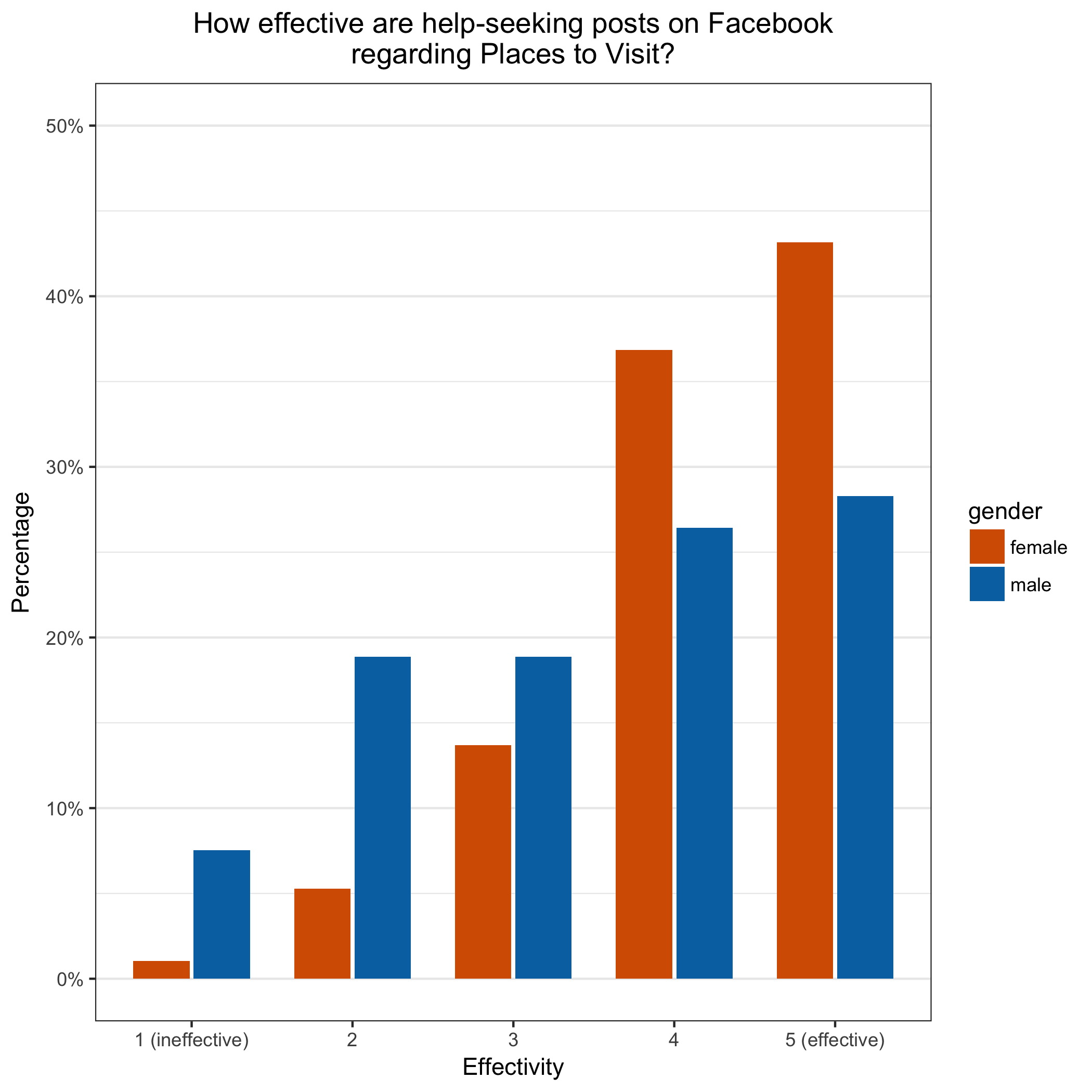
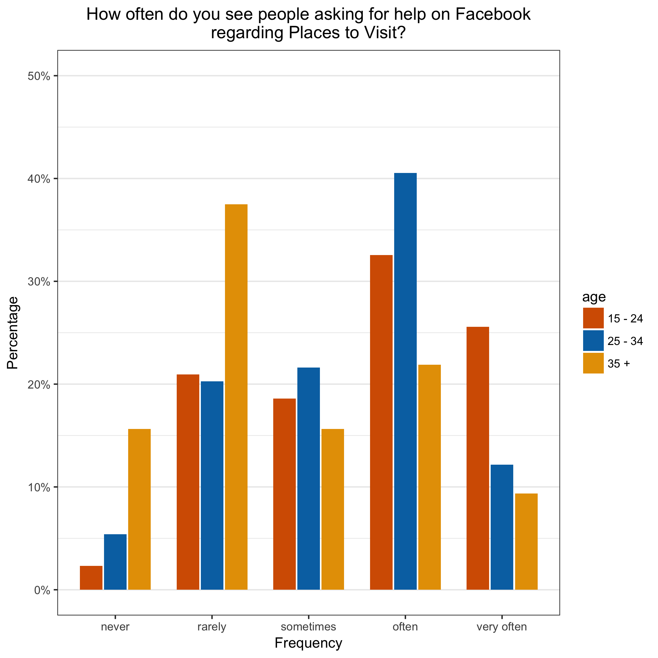
In a recent university project, I had to collect and analyze data via Google Forms. It was a survey about how people perceive frequency and effectively of help-seeking requests on Facebook (in regard to nine pre-defined topics). The questionnaire looked like this:  Altogether, the participants (N=150) had to respond to 18 questions on an ordinal scale and in addition, age and gender were collected as independent variables. In the first step, I did not want to do any statistical analysis but only visualize the results. For every question, I wanted to take a look at the distribution of the data in regard to gender and age. This not possible with Google Forms so I had to resort to more sophisticated visualization tools: R and ggplot2. The following image is the end product of this tutorial.
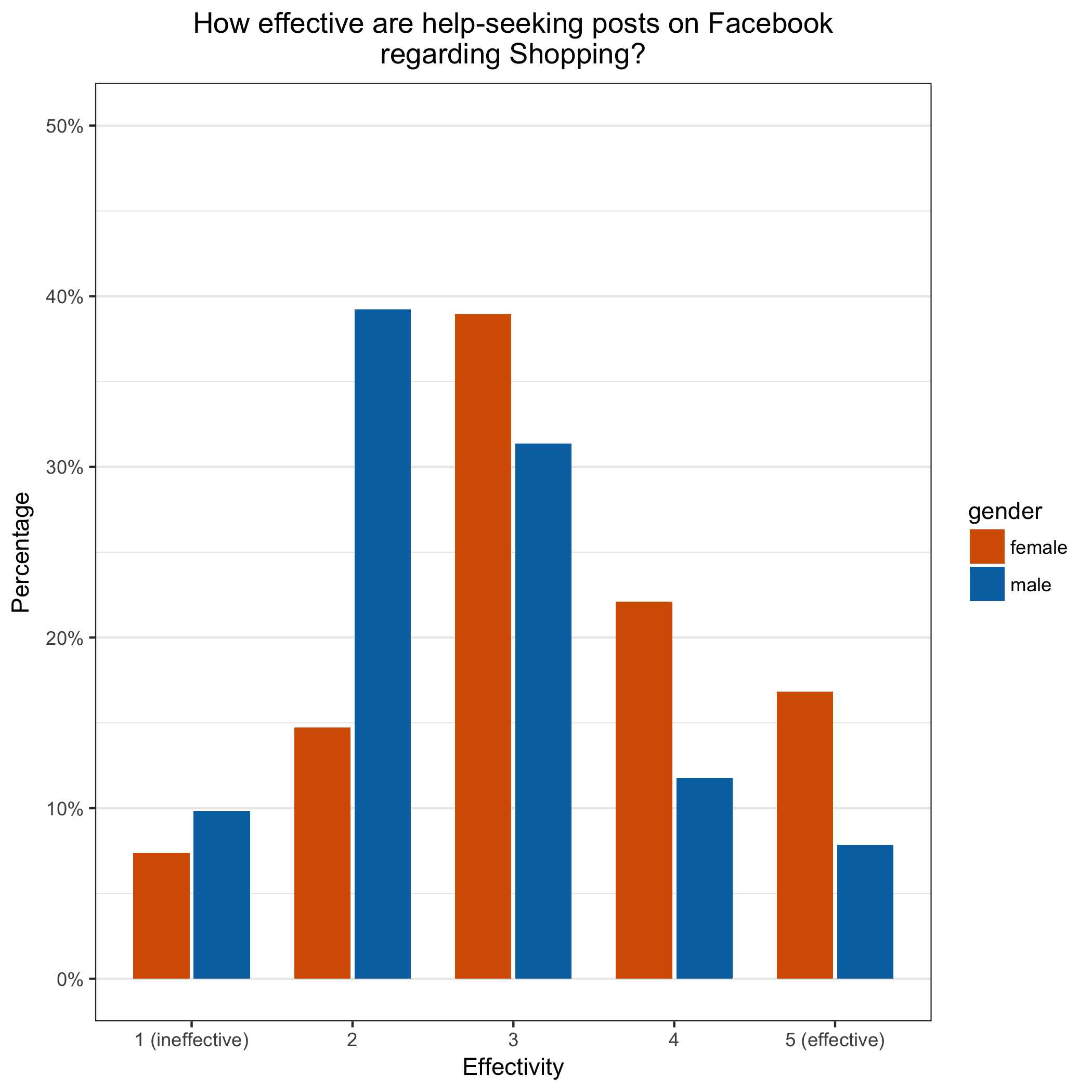
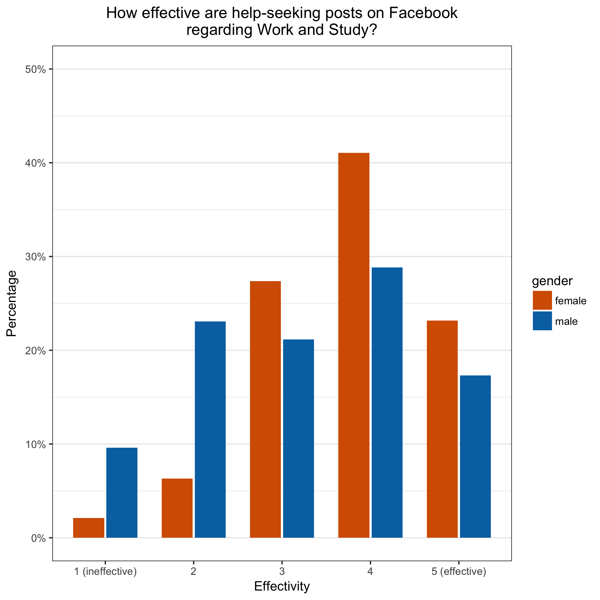
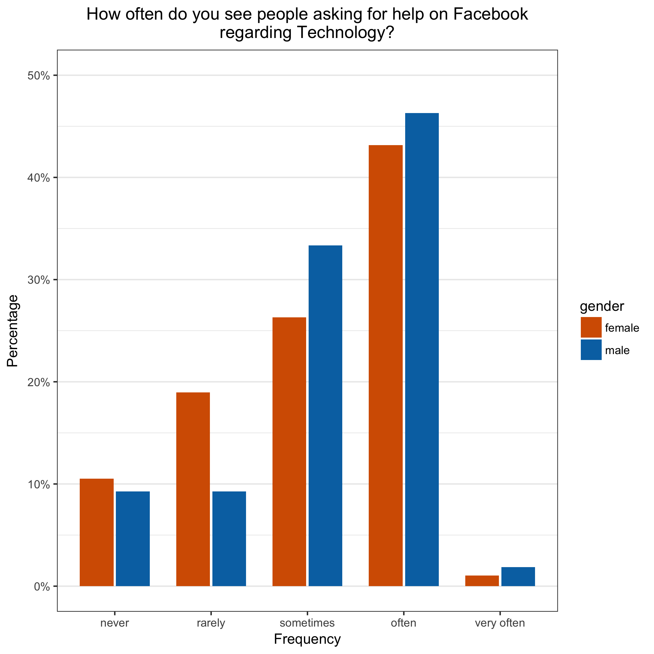
 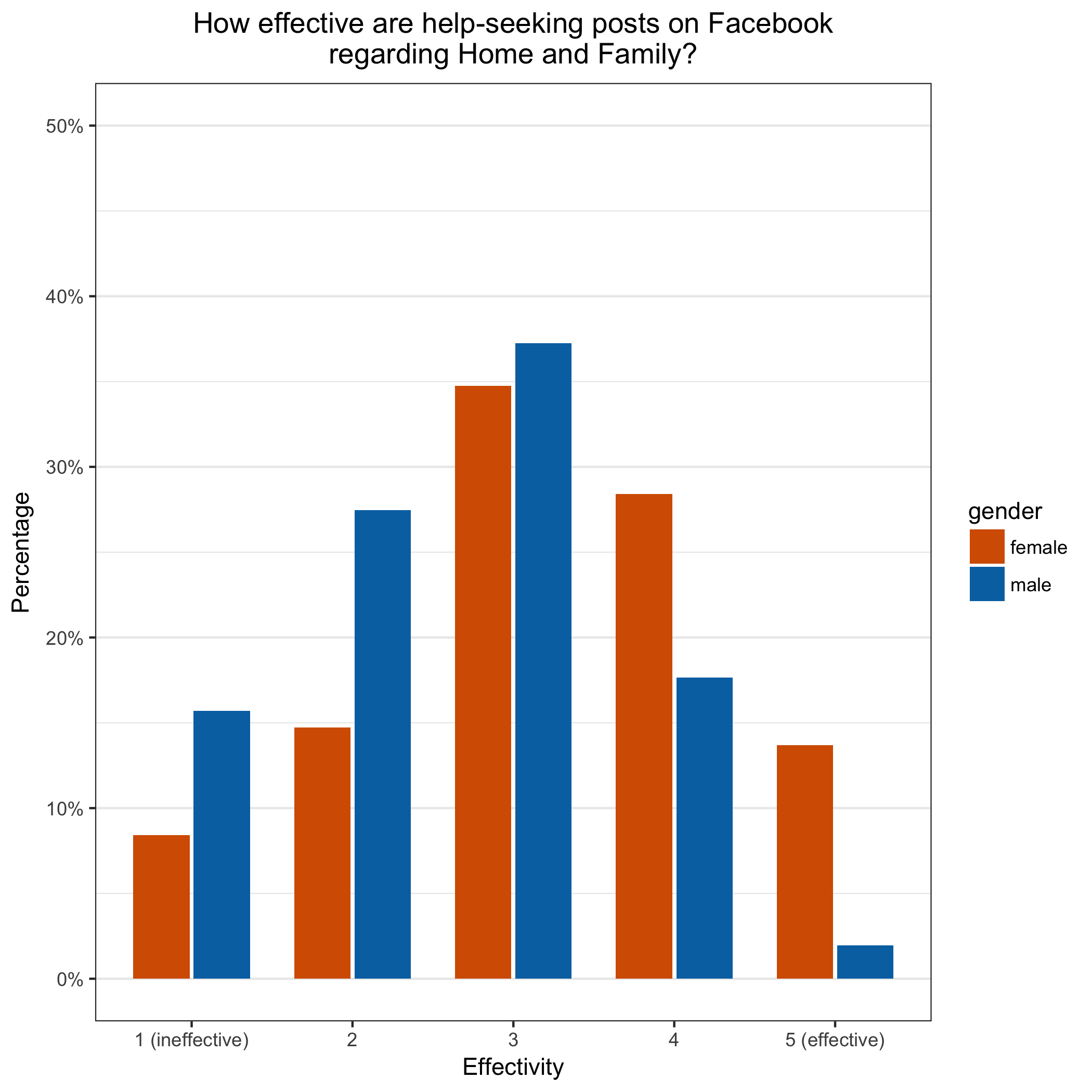 You can find the whole source code on Github and I will walk you through the essential steps of my code. In general, we want to create an R script that produced for every question two graphs. One where the responses are compares to the gender and one for the age. This allows to spot some interesting patterns in the data but also to present this images to and an audience. With this script, you can also easily re-draw all the graphs when the data gets updated. So you can write this kind of script for your survey and re-run it every time you collect more responses.
I prefer to demonstrate the use of R and ggplot2 on a real world example. It would be easier to do it with some mock data, but when you work in real world, you also have real-world problems. So when you apply it to your specific survey, your data probably needs some cleaning as well. I will go over the steps I had to do in my survey.
If you are new to R, I advise you to find some resources to get am overview over the language. I especially liked this free course from Code School. You may also need to check out the R documentation to get further information about some functions used.
So now, let’s get started! Make sure you have R and RStudio installed. And install the R packages ggplot2 and dplyr via the Console in RStudio:
install.packages("ggplot2")
install.packages("dplyr")
Create an RStudio project and put the data as .csv into the same folder as the project. First, read in the data.
data = read.csv("./data.csv", header=TRUE, sep=",")
Then rename the columns to make it easier to work with them.
colnames(data) <- c("time","gender", "age", "f_1", "f_2", "f_3", "f_4", "f_5", "f_6", "f_7", "f_8", "f_9", "e_1", "e_2", "e_3", "e_4", "e_5", "e_6", "e_7", "e_8", "e_9")
In this very case, I had ordinal data. But R cannot automatically know about them. So I have to create a create a vector and specify them. Here, for the frequency. We will save it in a variable and use it later.
f_levels <- c("never", "rarely", "sometimes", "often", "very often");
For the age, we chose to just ask from some ranges. This was a mistake and we had not enough responses for the older age buckets. As a result, we have to merge some attributes. This was more complicated than expected but the following snippet works.
i2 <- levels(data$age) %in% c("35 - 44", "45 - 54", "55 - 64", "65 +")
levels(data$age)[i2] <- "35 +"
I encapsulate the drawing of the graph into a function to stay DRY. I will explain the most important function arguments in the following explanations.
draw_chart <- function(df, prefix_column, x_title, new_levels, indep_col_name, question, topics)
Because we want to draw graphs for all the topics, we have to loop over all the topics.
for (i in 1:length(topics)) {
All of the following descriptions are done inside the loop. Each loop cycle works on one topic which in essence means one question of the survey. Now f transformation. First, we have to construct the name of the column. Second, we select the needed columns from the data frame into a new one. This allows doing destructive transformations on the new data frame. Third, we rename the columns and fourth, we filter out rows with empty values.
col_name <- paste(prefix_column, i, sep="")
cur_df <- df[,c(indep_col_name ,col_name)]
colnames(cur_df) <- c("indep_col" , "dep_col")
cur_df <- subset(cur_df, dep_col != "" & indep_col != "")
Afer that, we assign the levels we constructed earlier:
levels(cur_df$dep_col) <- new_levels
In the next step, we calculate the relative share of the responses in regard to the independent variable. Or in other words, we are not interested in the absolute number of responses but only how many percents of e.g. example women choose this specific attribute. This snippet makes use of the dply packet to transform the data. First, we group it, then summarize it and finally calculate the relative values.
cur_df <- cur_df %>%
group_by(indep_col, dep_col) %>% # NB: the order of the grouping
summarise(count=n()) %>% mutate(perc=count/sum(count))
We are ready to draw the graph. I skip all the part regarding the labeling of the graph. It’s trivial and you check it in the code example. Frist, I have to tell ggplot what data frames and how the columns of the data frames are mapped onto the graph.
ggplot(data=cur_df, aes(x=dep_col, y=perc, fill=indep_col)) +
Then, I specify further details regarding the representation of the bars. The width is the width of the “groups”. The position*dodge argument is needed to show this kind of diagram. stat=“identity” is needed because with the default, ggplot counts and presents the specific values. We already calculated what to present (the percentages) before and want to show them. Therefore “identity”.
geom_bar(width=0.7, position=position_dodge(width=0.75), stat="identity") +
This line changes the label of the y-axis to percentages and also specifies a limit. It ensures that every graph has the same range for the y-axis which greatly improves comparability among all the graphs.
scale_y_continuous(labels=scales::percent, limits=c(0, 0.5)) +
This changes the labels.
labs(y = "Percentage", x=x_title, title=diagram_title, fill=indep_col_name) +
The following lines, first set up the general theme, and then change it do hide all vertical lines because there not needed and distract. In addition, the diagram title is centered and the default color palette is changed.
theme_bw() + theme(panel.grid.minor.x=element_blank(), panel.grid.major.x=element_blank(), plot.title = element_text(hjust = 0.5)) + scale_fill_manual(values=cbPalette)
Puh, we are almost done. Now we have to save the image to the disk. For this, we first have to create the folder if needed and then save the plot. It is referenced by last_plot().
dir_path <- paste(getwd(), "/graphs/", indep_col_name, sep="")
dir.create(dir_path, recursive=TRUE, showWarnings=FALSE) # ignore warning if folder already existent
file_name <- paste(x_title, topics[i], ".png", sep="")
ggsave(file_name, last_plot(), "png", path=dir_path)
This was all that happened in the loop and also in the function. Now we just call the function four times with altered parameters.
draw_chart(data, "f_", "Frequency", f_levels, "gender", f_question, topics)
draw_chart(data, "e_", "Effectivity", e_levels, "gender", e_question, topics)
draw_chart(data, "f_", "Frequency", f_levels, "age", f_question, topics)
draw_chart(data, "e_", "Effectivity", e_levels, "age", e_question, topics)
All the resulting images will be in the folder graphs. Here is the complete code once again and at the end of the post are some more resulting charts. I hope this tutorial helped you a little bit.